Slate
Slate Kit is a robust framework that we offer to enable the display of complex UI components within the community platform. For instance, consider the following JSON representation, showcasing how Slate Kit can be utilized to generate the Zapier settings page:
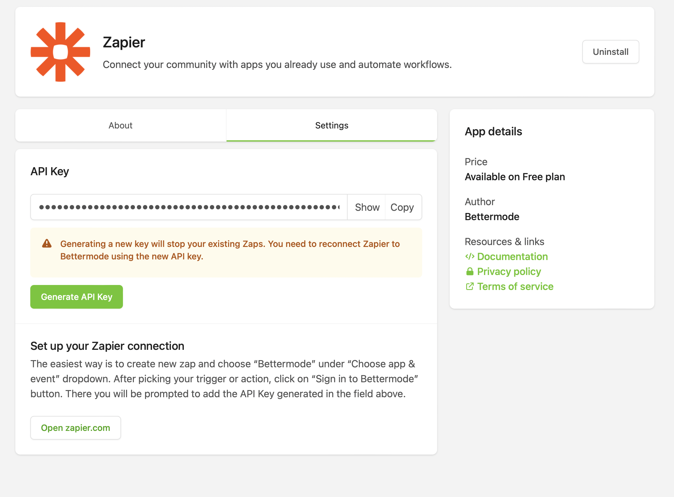
{
    "rootBlock": "root",
    "blocks": [
        {
            "children": ["header","content","divider","second-header","second-content"],
            "id": "root",
            "name": "Card",
        },
        {
            "children": [],
            "id": "header",
            "name": "Card.Header",
            "props": {
                "title":"API Key"
            }
        },
        {

            "children": ["api-key-input","alert","generate"],
            "id": "content",
            "name": "Card.Content",
            "props": {
                "className": "space-y-3"
            }
        },
        {

            "children": [],
            "id": "api-key-input",
            "name": "Input",
            "props": {
                "name":"token",
                "readOnly":true,
                "hideValue":true,
                "value":"zapier-api-key",
                "copy":true
            }
        },
        {

            "children": [],
            "id": "alert",
            "name": "Alert",
            "props": {
                "status":"warning",
                "title":"Generating a new key will stop your existing Zaps. You need to reconnect Zapier to Bettermode using the new API key."
            }
        },
        {

            "children": ["generate-button-text"],
            "id": "generate",
            "name": "Button",
            "props": {
                "callbackId":"generate",
                "variant":"primary"
            }
        },
        {

            "children": [],
            "id": "generate-button-text",
            "name": "Text",
            "props": {
                "value":"Generate API Key"
            }
        },
        {

            "children": [],
            "id": "divider",
            "name": "Divider",
            "props": {
                "padding":"none"
            }
        },
        {

            "children": [],
            "id": "second-header",
            "name": "Card.Header",
            "props": {
                "title": "Set up your Zapier connection","description":"The easiest way is to create new zap and choose “Bettermode” under “Choose app & event” dropdown. After picking your trigger or action, click on “Sign in to Bettermode” button. There you will be prompted to add the API Key generated in the field above."
            }
        },
        {

            "children": ["second-card-button"],
            "id": "second-content",
            "name": "Card.Content",
        },
        {

            "children": ["link"],
            "id": "second-card-button",
            "name": "Button",
            "props": {
                "variant":"outline"
            }
        },
        {

            "children": ["link-text"],
            "id": "link",
            "name": "Link",
            "props": {
                "href":"https://zapier.com/apps/tribe/integrations",
                "external":true
            }
        },
        {

            "id": "link-text",
            "name": "Text",
            "props": {
                "value":"Open zapier.com"
            }
        }
    ]
}
As you can see it consists of two important properties. rootBlock and blocks. Let's dive in to each ones in detail.
Block
A block is a JSON object that can be translated to an HTML element. It has the following properties:
idThis the ID of the block and it is important because it determines the position of the element in the HTML hierachy.nameThis is the name of the component.propsThese are attributes to be passed to the element.childrenThis is an array of IDs that demermines which elements must be added to this element.
Let's look at the example below
{
    "id": "link-text",
    "name": "Text",
    "props": {
        "value":"Open zapier.com"
    }
}
This is a simple Text element that shows a text.
Blocks
Each slate consists of different blocks. Look at the example below:
[
    {
        "children": ["api-key-input","alert","generate"],
        "id": "content",
        "name": "Card.Content",
        "props": {
            "className": "space-y-3"
        }
    },
    {

        "children": [],
        "id": "api-key-input",
        "name": "Input",
        "props": {
            "name":"token",
            "readOnly":true,
            "hideValue":true,
            "value":"zapier-api-key",
            "copy":true
        }
    },
    {

        "children": [],
        "id": "alert",
        "name": "Alert",
        "props": {
            "status":"warning",
            "title":"Generating a new key will stop your existing Zaps. You need to reconnect Zapier to Bettermode using the new API key."
        }
    },
    {

        "children": ["generate-button-text"],
        "id": "generate",
        "name": "Button",
        "props": {
            "callbackId":"generate",
            "variant":"primary"
        }
    },
    {

        "children": [],
        "id": "generate-button-text",
        "name": "Text",
        "props": {
            "value":"Generate API Key"
        }
    }
]
The JSON above can be translated to the following React format:
<Card.Content className="space-y-3">
    <Input name="token" readOnly hideValue value="zapier-api-key" copy></Input>
    <Alert status="warning" title="Generating a new key will stop your existing Zaps. You need to reconnect Zapier to Bettermode using the new API key."></Alert>
    <Button callbackId="generate" variant="primary">
        <Text value="Generate API Key"></Text>
    </Button>
</Card.Content>
Root block
The rootBlock is a crucial property that determines the initial block that must be the first element within the slate. It plays a pivotal role in the proper functioning of the slate structure. It is essential to ensure that a block with the same ID as the rootBlock is present; otherwise, the slate may not work as intended.
[
    "rootBlock": "root-block-id",
    "blocks": [
        {
            "children": [],
            "id": "root-block-id",
            "name": "Text",
            "props": {
                "value":"Generate API Key"
            }
        }
    ]
]
List of available blocks
| Name | Props | Note | |
|---|---|---|---|
| Accordion |
|
| |
| Alert |
| ||
| Button |
| size is set to md by default. | |
| CallToAction |
|
| |
| Card |
| Since this is a layout element, it is important to pass some children. | |
| Card.Content | Since this is a layout element, it is important to pass some children. | ||
| Card.Header |
| Since this is a layout element, it is important to pass some children. | |
| Card.Footer |
| ||
| Container |
| Since this is a layout element, it is important to pass some children. | |
| Divider |
| ||
| Form |
| ||
| Icon |
| ||
| Iframe |
| ||
| Image |
| ||
| Input |
| ||
| Link |
| ||
| Markdown | text | You should pass text to show the text. | |
| RichText |
| You should pass content to show the text. | |
| Select |
| You should pass content to show the text. | |
| Text |
| You should pass value to show the text. | |
| Textarea |
| ||
| Toggle |
|
Common props
| Prop's name | definition |
|---|---|
| className | This is the class attribute of the final html element. You can use Tailwind CSS classes. |
| name | This is used mostly for elemenst inside a Form. |
| callbackId | This is used mostly for elemenst inside a Form. |